This week, my learning pod met up to work on our free inquiry project. Our goal was to compile all of our research and notes to form the basis of our infographic. After splitting up the work, I finished my targeted aspects of the assignment, and added them to our Canva infographic.
Collectively, we made sure all of our sub-sections flowed and worked well together. We worked together to organize our inquiry project findings within our infographic in a way that was visually appealing.
One challenge we discovered was that some of our sections had a lot of information, which was hard to read. We fixed this by adding color to the headers, and breaking up the sub section by smaller topics/paragraphs.
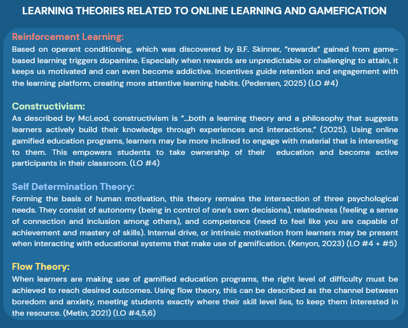
This was a portion of the infographic I was working on. I utilized the signaling principle (from theories of multimedia learning) to make the headings obvious, increasing readability and making the text more scannable (rather than being one giant block of text).
After receiving suggestions from Colin last week too, we discussed how we wanted to show how our work connected to EDCI 339 learning outcomes. We decided to explicitly write how our infographic content related to learning outcomes within our text, making it obvious for readers.
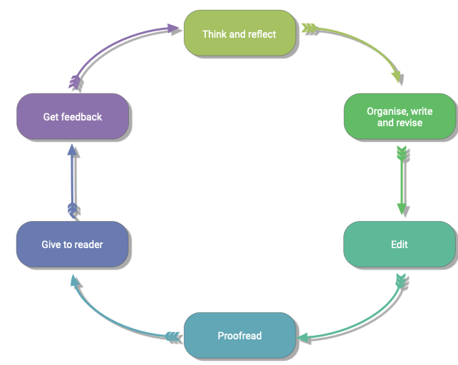
After playing around with layouts, themes, text organization, and image input, we plan on re-visiting our infographic next week to make any final changes and make edits to the text. This final review session will be beneficial, as it will allow us to revise and proofread the project with a fresh view.
Our hope is that we will have the final project finished and ready to submit after making these final changes!
Leave a Reply